

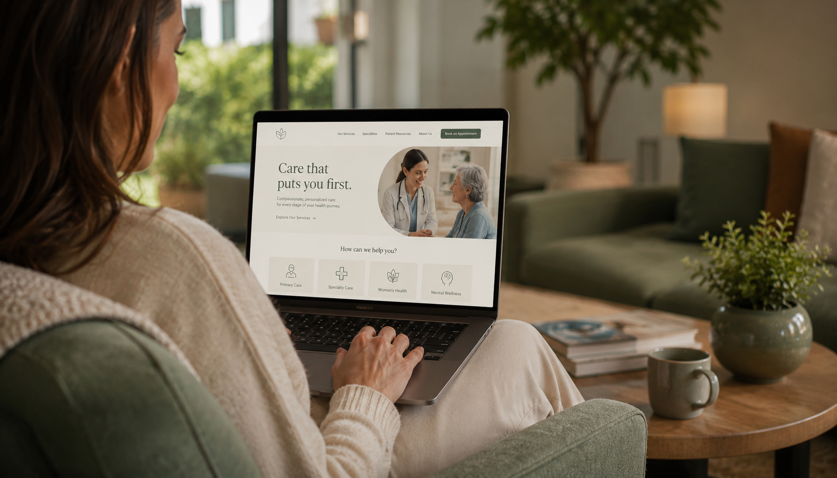
The Hospitality Effect: Why Modern Healthcare Brands are Trade In White Walls for Warm Vibes
Let’s be honest: nobody logs onto a medical patient portal or reads a pharmaceutical website because they are having a great day. Usually, people are there because they are stressed, confused, or looking for answers for a sick family member.
So why do most healthcare and pharma websites still feel like walking into a cold, clinical waiting room with flickering fluorescent lights?
For years, medical branding and digital health accessibility focused strictly on checking compliance boxes. The result? Cold white grids, confusing drop down menus, and a total lack of empathy. But a massive shift is happening right now. The smartest healthcare and pharmaceutical companies are realizing that to build deep consumer trust, they need to stop looking at medical textbooks for inspiration and start looking at luxury boutique hotels.
Welcome to the “Hospitality Effect” in healthcare UX design. Here is why humanizing the clinical journey is the ultimate competitive advantage, and how your brand can make the switch.
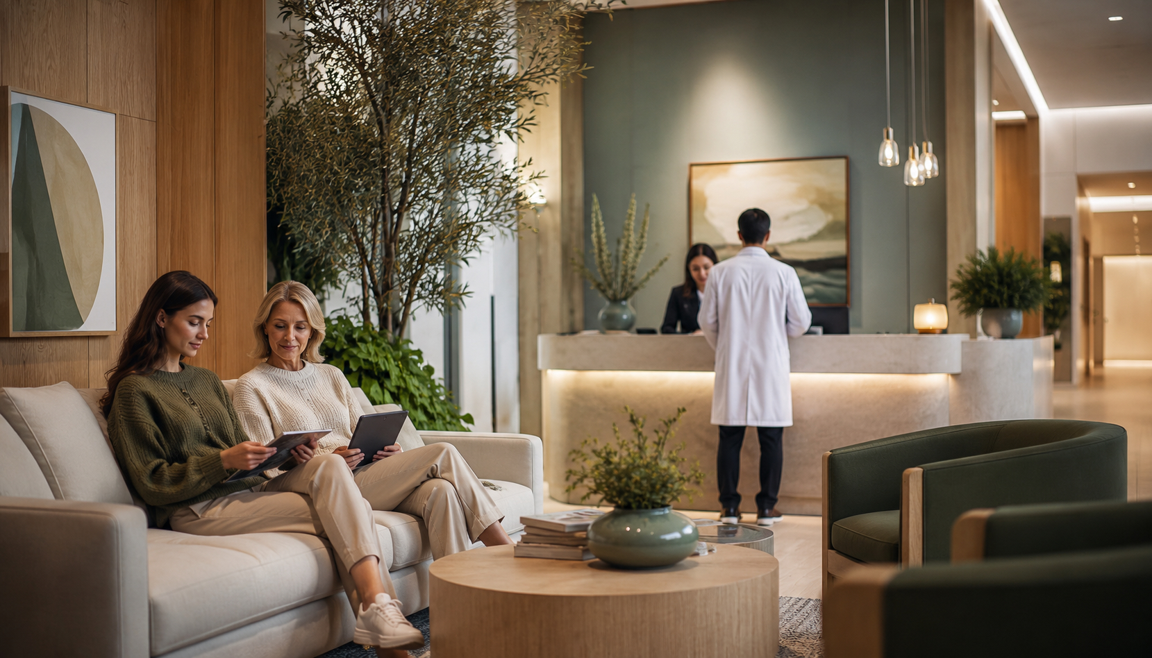
1. Ditching the Clinical Grid for Warmth
When you check into a great hotel, the lighting is soft, the colors are calming, and everything is designed to lower your heart rate. Your website should do the exact same thing.
Instead of stark, clinical whites and aggressive neon blues, modern healthcare spaces are adopting sensory design choices borrowed straight from luxury hospitality. We are talking about rich, grounded color palettes think mineral greens, soft clays, and warm neutrals. When video is used, it features diffused, natural lighting rather than harsh studio setups.
This isn’t just about looking pretty; it’s about lowering cognitive fatigue. When a patient or caregiver lands on a page that feels calm and grounded, their anxiety drops, and their ability to absorb complex medical information goes up.
2. Creating a “Concierge” Patient Centric Interface
Think about the last time you used a frustrating medical portal. You probably had to dig through endless tabs just to find a simple test result or refill a prescription.
Hospitality thrives on anticipation, knowing what the guest needs before they even ask. A truly patient centric interface applies that exact concierge mindset to digital health.
Through smart, predictive UX design, a website can recognize why a user is there based on simple behavior patterns. If a patient frequently logs in on the 1st of the month, the button to “Renew Prescription” should be front, center, and accessible in exactly one click, especially on a mobile phone, where most of this browsing actually happens.
3. True Accessibility is the Ultimate Form of Hospitality
In the hotel industry, accessibility means making sure every single guest can enjoy the property equally, regardless of physical ability. In digital healthcare, that means designing for strict WCAG accessibility standards so everyone can navigate your data.
But accessible design doesn’t have to look boring or robotic. By building locked, on brand design systems, you can create a gorgeous aesthetic that simultaneously supports screen readers, features high contrast text ratios for low vision users, and simplifies navigation for people experiencing physical tremors or high stress.
When you make your website easy for a vulnerable patient to use, you aren’t just complying with regulations, you are showing them respect. And respect is the fastest way to build bulletproof brand loyalty.
The Bottom Line: Empathy Wins
At the end of the day, people don’t leave their humanity behind just because they are interacting with a healthcare or pharmaceutical brand. They want to feel seen, taken care of, and guided through what can often be a scary process.
By bringing the warmth, ease, and sensory awareness of hospitality creative strategy into the healthcare sector, you transform your digital assets from sterile information drops into comforting, highly effective spaces.